Take this Suntory Malt Whisky Advertisement. The word かっこいい (meaning handsome, stylish, or cool), is in this case presented as カッコイイ. Notice the aesthetic of the ad as a whole. The image conveys a specific sharpness. The man's face is as well defined as the glass he's holding. And to match this image, katakana is used to make the word かっこいい look like it's definition. In the same way that typography is key to advertisements in English, choice of script is equally important to advertisements in Japanese. Katakana makes the ad's message more immediate and consistent, and consequently, very effective.
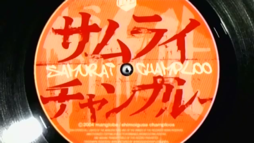
In addition to emphasizing Japanese words, katakana is very important for its use in brand names. This is an image of a record of music from the anime Samurai Champloo. Anime names are quite often written in katakana, to emphasize the sound of the name rather than its meaning, and to make it more readable (compared to kanji). Samurai Champloo is even stylized in romaji as well. Like the Suntory ad, the katakana has a sharper look than the equivalent さむらいちゃんぷるー. This emphasis makes katakana in brand names incredibly popular. Whereas hiragana words have no identity but a strong meaning, katakana have a strong identity but very little meaning. "Champloo" is an Okinawan word meaning "somegthing mixed" that is the name of a Okinawan stir-fry dish. While a few may know that and understand its relevance to the show, everyone can understand that Champloo distinguishes the name from other animes, which is why the katakana is such a good choice.
Our textbook readings describe katakana in different manners because while it is used for loanwords, emphasis, and onomatopoeia directly, its use in the categories serve a wider category of goals and bring with it a wider variety of meanings. All of them may explain the three cases in which katakana is used, but explaining why it is used is a more difficult task to do in such a short description, and is better grasped by looking at examples of katakana within Japanese culture.


Yeah, I'd agree aesthetics in banner advertisements and the like are a big reason for choosing katakana over hiragana or kanji. Being able to use three scripts and mix and match them to look the "coolest" is an interesting flexibility for Japanese.
ReplyDeleteThey also sometimes mix in random English words as well while they're at it too. I know I was in a Japanese supermarket once, and the different categories of food were labeled in big letters around the walls of the store, but in English. When I asked my Japanese host parent about it, he said it was probably simply for design purposes rather than for any real reason (like giving Japanese people a chance to practice English -- ha!)
The aesthetics portion of your analysis is incredibly interesting. It is a point that I don't think anyone else has brought up. The one with the ad makes a lot of sense because they would want the letters to reflect the brand name. I imagined the same ad with hiragana and it didn't seem to fit. I used to watch Samurai Champloo which makes you next analysis close to my heart. It makes sense that they wouldn't right samurai in Kanji in order to make it easily readable. The usage of Champloo completely throws me off thought. Then again we are asked to analyze the use of katakana not word choice on behalf of the creators.
ReplyDeleteThe physical appearance afforded by each type of script seems to result in vastly differing results in their usage, as you point out. The Samurai Champloo example is a great one. Considering the context and content of the material, the カタカナ script evokes images of slashes and cuts, very apt for the subject matter.
ReplyDeleteYour selection of the Suntory ad is also fantastic, not the because I now how "じゃあ、サントリタイム" running through my mind nonstop now...
Samurai Shamploo!!!! I love that anime.
ReplyDeleteI agree with your analysis that katakana is used for Samurai Shamploo to give the title a sharp edge. I also think there are many factors why the title would be written in Katakana. First, Katakana was the first written style in pre-modern times; therefore, Samurai at that time would have used Katakana. Second, Samurai cartoons involve action and Katakana has a much more crisp quality than Hiragana.
Also, your example of かっこいいis also very appropriate. By using katakana, not only is the word emphasized but also the product is advertised much more effectively. Overall, nice job and looking forward to seeing the final analysis!
I think this is a great analysis of the aesthetically pleasing use of カタカナ. I'm actually only a fan of カタカナ when they are used in print because, as you note, they make a statement in relation to the image as a whole. It is part of the ingenious methods of marketing employed in Japan. I have never researched this, but are there ads that use only hiragana? If so, when was an emphasis placed on Katakana? Maybe you can do a comparative analysis.
ReplyDeleteAnyway, 本当に面白かったと思うよ。I though it was really interesting.